Venetogravel finisher stats
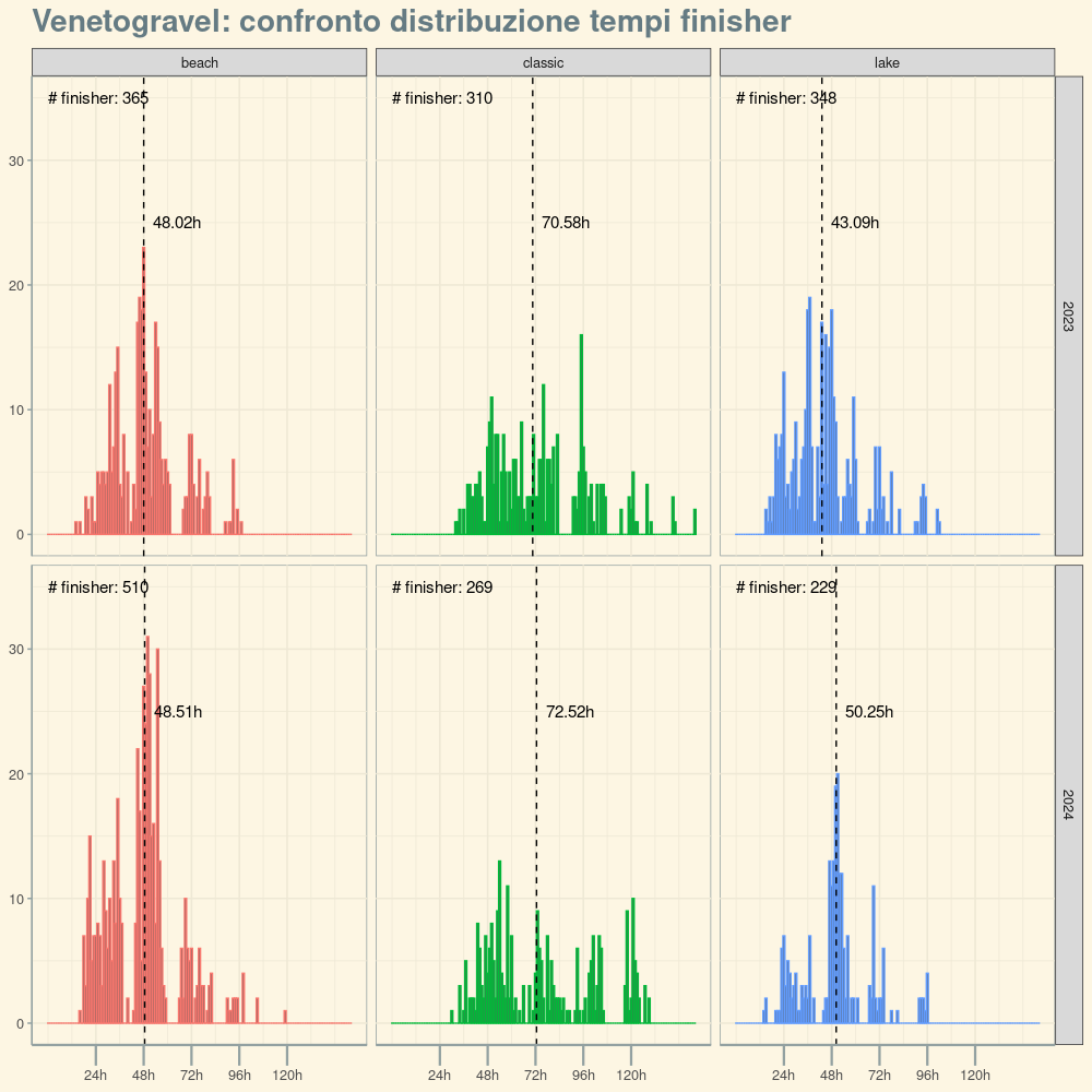
The organization of Venetogravel published the finisher stats for the 2024 edition. I grabbed this data and the datapoints from 2023 to plot some charts.

"beach", "classic" and "lake" represent three different routes each participant could choose from, respectively ~400km (2800m total ascent), ~720km (4300m), ~400km (1800m). The editions of 2024 and 2023 presented the same choices, with the major difference that the direction of the routes was reversed. 2024's edition had also a new 200km (2800m) option which I didn't analyze.
I was interested to see if the median finisher time (indicated by the dashed line in the charts) would change, which I intended as a possible answer to the question "Would reversing the direction make the routes easier or harder?".
Data show that for "classic" and "beach" it didn't change, but the value is significantly higher for 2024 for the Lake route. (I, by the way, completed the Lake route in 53 hours and 16 minutes).
Not sure how to explain that. It's true the weather was worst in 2024, and I know several cyclists (including me) were blocked by a storm on Sunday, but that lasted only a couple of hours, not enough to explain the significant increase in median time.
Perhaps the population of cyclists that chose the Lake route was made of less experienced athletes, that had to take more time to complete it. Not sure.
How I made the charts
First I load and transform the files I obtained from the website:
classic2023 <- processfile("2023/data/classic.txt", "classic", 2023)
beach2023 <- processfile("2023/data/beach.txt", "beach", 2023)
lake2023 <- processfile("2023/data/lake.txt", "lake", 2023)

classic2024 <- processfile("2024/data/classic.txt", "classic", 2024)
beach2024 <- processfile("2024/data/beach.txt", "beach", 2024)
lake2024 <- processfile("2024/data/lake.txt", "lake", 2024)
here the body of processfile:
convert_elapsed_time_to_minutes <- function(elapsed_time_str) {
  time_parts <- str_split(elapsed_time_str, ":")[[1]]
  hours <- as.integer(time_parts[1])
  minutes <- as.integer(time_parts[2])
  total_minutes <- (hours * 60) + minutes
  result <- total_minutes
}

processfile = function(filepath, track, year) {
  df <- read.table(
    text=gsub(" – ", "\t", readLines(filepath)),
    sep="\t"
  )

  names(df) <- c("country", "name", "elapsed_time")

  return(df
         %>% rowwise()
         %>% mutate(elapsed_time_minutes = convert_elapsed_time_to_minutes(elapsed_time))
         %>% mutate(track = track)
         %>% mutate(year = year)
         %>% filter(elapsed_time_minutes > 0)
         %>% filter(elapsed_time_minutes < 10000) # filter outliers
         %>% select(country, track, year, elapsed_time_minutes)
  )
}
Then we put together these dataframes, and compute some aggregated stats
data <- bind_rows(classic2023, beach2023, lake2023,
                  classic2024, beach2024, lake2024)

data_medians <- data %>% group_by(year, track) %>% summarize(x=median(elapsed_time_minutes))

data_count <- data %>% group_by(year, track) %>% summarize(x=n())
We're ready to produce the chart using ggplot:
x_labels <- function(m) {
  res <- round(m / 60, 2)
  paste(res, 'h',sep = "")
}

ggplot(data, aes(x=elapsed_time_minutes, color=track)) +
  geom_histogram(binwidth = 60) +
  facet_grid(cols=vars(track), rows = vars(year)) +
  geom_vline(data = data_medians, aes(xintercept = x),
             linetype="dashed") +
  geom_text(
    data=data_medians,
    aes(x=x, label=x_labels(x), y=25),
    size = 4,
    nudge_x=+1000,
    color = 'black'
  ) +
  geom_text(
    data=data_count,
    aes(x=0, label=paste("# finisher:", x), y=35),
    size = 4,
    nudge_x=1500,
    color = 'black'
  ) +
  scale_x_continuous(breaks=c(60*24, 60*48, 60*72, 60*48*2, 60*24*5),
                     label=x_labels) +
  xlab("Tempo totale") +
  ylab("Numero di finisher") +
  theme_solarized() +
  theme(
    legend.position = "none",
    axis.title = element_blank(),
    axis.line.x = element_line(linewidth=.8),
    axis.ticks.x = element_line(linewidth = .8) ,
    axis.ticks.length.x = unit(.5, "cm"),
    panel.border = element_blank(),
    panel.grid = element_blank(),
    plot.title = element_text(face="bold", size=21)
  ) +
  ggtitle("Venetogravel: confronto distribuzione tempi finisher")